


Unraveling the Mysteries of Color Choices in Fiber Arts
How to choose colors for fiber art projects, including knitting, crochet, weaving, and spinning and dyeing yarn.

Hello friend,
I thought it would be fun to chat about color work projects this week. It can feel overwhelming to choose yarns and colors ahead of starting a project. Browsing yarns can feel intimidating… there are just so many options! Let’s explore some tips and tricks to help you make intentional color choices from the start, to produce a finished item that you love.
Fiber and yarn selection for color work
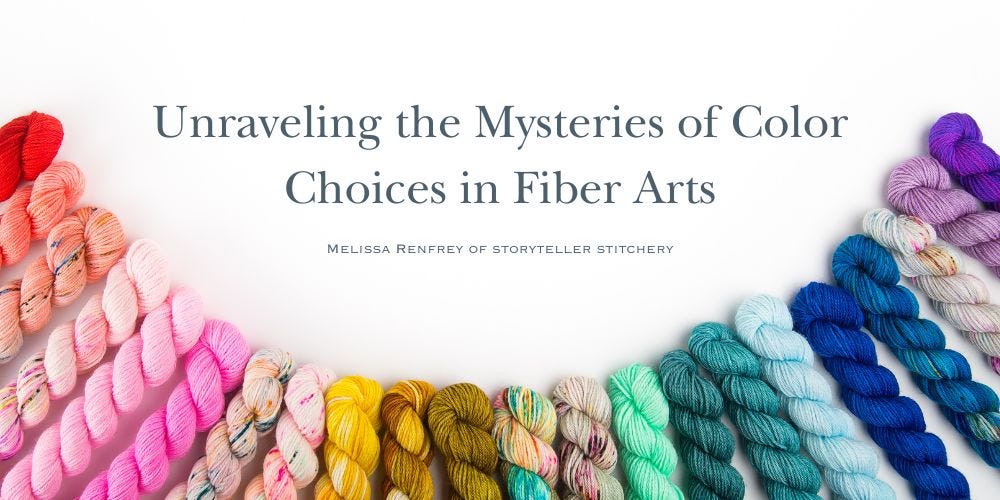
The yarn colors you choose make a big difference in the appearance of the final project.
Different fibers dyed in the same color will often be visually different in a project. For example, merino wool and mohair will look different even when dyed with exactly the same color dye. Different fibers absorb and show the colors in different ways.
Novelty yarns, such as bouclé and chenille, will affect color work. A heavily textured yarn can “dominate” other colors and yarns when looking at the finished piece. This isn’t necessarily a bad thing though - you can create some fun and interesting fabrics by mixing textures! But it is not the best option if you want to see highly contrasting colors.

Image: Knitted sweater using BFL (Blue Faced Leicester) yarn. I dyed these yarns to have high contrast for the pattern of the color work. Pattern is “Navelli” by boylandknitworks

Combining Colors
Color theory holds true for fiber arts as much as any other art! Using a color wheel (like the kind you find at an art store) can be really helpful in choosing colors of your project. Maybe you already have a beautiful skein that you want to use and you are trying to choose coordinating colors. A color wheel and color theory can help you make choices before you even shop for yarn, to help guide you once in the yarn store or browsing indie dyers online.
Contrast & harmony can be achieved by the yarns and colors that you choose. There isn’t a “correct“ choice here. It is all a matter of preference in how much contrast or harmony you want in your finished project. Your preference should guide you to select yarns with colors that stand out or blend together.
What is the purpose of the item? Let that guide your color selection. For example, if you are making an item of clothing, what is missing from your wardrobe and what will coordinate with the rest of your wardrobe? Do you need a neutral black sweater with some color work in the yoke to pair with your favorite jeans and skirt? Did you see a bright, multi-colored scarf on instagram that you want to recreate? Also consider if it for daily use, a decoration, or to give as a gift. Do these factors influence your color choices?
Variegated yarns (meaning yarns containing more than one color per skein) will create very different effects. There are a couple of things to consider:
Pairing more than one variegated yarn in color work can result in less contrast as the colors “mix” more throughout the project. If you want higher contrast in color work with a variegated yarn, pairing it with a high-contrast color in solid (yarn that is all one color) can be helpful to achieve a contrasted look.
Pooling can happen when yarns are dyed with long runs of color. Again, this can be a desired effect, such as micro-striping that can occur in a pair of knitted socks.


Image: I dyed this yarn with long stretches of color in the skein, to create pooling that knits up as micro-stripes in this pair of socks. Pattern is “Coffee Talk Socks” by Tracie Millar.

Getting started with color work
Experiment! Test yarn and color combinations by swatching before committing to yarn selections for the project. Swatching (knitting a small sample, often a 4-6 inch square) can help you see how various yarns will look when knitted together into one fabric. If you don’t like the look achieved in that swatch, you probably aren’t going to enjoy it in your final project! You can learn so much from a swatch with just a small investment of time to knit up a small square.
Check contrast using your phone camera. This is such a quick and easy way to see whether the colors will have good contrast or will harmonize and blend. Simply take a photo of your yarn selections then add a filter to view them in black and white. If there is visible difference between the yarns, there will be contrast in the final piece. If the yarns look very similar in the black and white filter, however, the contrast will be low and you will achieve more of a harmonious result when knitted up together. I’ll have a post on exactly how to do this in the next few weeks.
Ask for help
If there is a Local Yarn Store (LYS) near where you live, talk to the staff. Generally you will find them to be a wealth of information and more than happy to chat about your project to help you find the yarn and colors to help you achieve the finished item you are looking for.
Alternatively, there are many online indie dyers. Some offer virtual shopping sessions allowing you to connect virtually. Even through email, however, they are typically happy to answer questions and share suggestions to help you find the right options.

Ultimately, selecting yarns and colors for your project comes down to personal preference. There really isn’t a “right or wrong”, it is just a matter of choosing fiber materials to achieve the look you want, whether it is knit, crochet, weaving, or even spun and plied yarn. Fiber artists get to experiment and choose exactly what they want from their finished item! The journey of making is what fine-tunes your instincts and builds your knowledge and skill.
Leave a comment to let me know what you find most challenging in choosing yarns for color work. What tips and tricks do you use?